
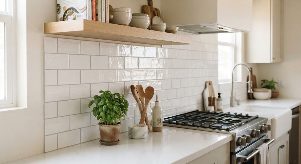
Subway tile is one of those design choices that can look completely different depending on how you arrange it. The same rectangular tile can feel traditional, modern, playful, or dramatic simply by changing the direction and spacing of the pattern.
The right subway tile layout also does more than change the appearance of a wall. It can influence how wide, tall, large, or visually balanced a room feels. That makes the layout worth planning before the first tile is installed.
From the familiar running bond to vertical stacks, herringbone, and more creative combinations, there are plenty of ways to work with subway tile. The best option depends on the room, tile proportions, grout lines, focal points, and the overall look you want.
What Is a Subway Tile Layout?
A subway tile layout is the pattern used to arrange rectangular subway tiles on a wall, backsplash, shower, or other surface.
The classic subway tile is rectangular, often with a simple horizontal arrangement and staggered joints. However, modern installations can place the same tiles vertically, diagonally, in a straight stack, or in more decorative patterns.
The layout affects several things:
- The visual direction of the wall
- How prominent the grout lines appear
- Whether the space feels wider or taller
- How much attention the tile pattern attracts
- How the tile works around corners, outlets, cabinets, and fixtures
- How much cutting and planning the installation requires
That is why choosing the tile itself is only half the decision. The pattern can be just as important.
Popular Subway Tile Layout Patterns
There is no single right way to arrange subway tile. Each pattern creates a different visual effect and works better in certain situations.
1. Classic Running Bond
The running bond is the traditional subway tile arrangement. Each row is offset from the row above it, commonly by half the length of the tile.
For example, a long rectangular tile is laid horizontally, with the centre of one tile lining up with the joint between two tiles in the next row.
This pattern works especially well when you want a familiar, relaxed look.
Good for:
- Kitchen backsplashes
- Bathroom walls
- Shower surrounds
- Traditional interiors
- Transitional kitchens
The staggered horizontal lines can also make a wall appear longer, especially when the tiles are installed across a wide backsplash.
2. Straight Stack
A straight stack removes the stagger and lines the tiles up in neat vertical and horizontal columns.
The result is much more structured than a traditional running bond.
A straight stack can work particularly well in contemporary interiors because the clean grid feels deliberate and uncluttered. It also lets the tile shape become more noticeable because the grout lines form a strong geometric framework.
Try this pattern when you want the tile to look modern without introducing a complicated decorative pattern.
3. Vertical Stack
Vertical stack is similar to the straight stack, but the rectangular tiles are turned so their long dimension runs vertically.
This creates a strong upward direction.
It can be useful in rooms where you want to emphasize height, such as:
- Bathrooms with low ceilings
- Shower walls
- Narrow powder rooms
- Small entry areas
A vertical arrangement can make the wall feel taller, although it does not physically increase the ceiling height.
This pattern is particularly effective with simple tile colours because the installation direction becomes the main design feature.
4. Vertical Running Bond
For a softer alternative to a vertical stack, rotate the subway tiles vertically and stagger the rows.
The result combines the traditional movement of a running bond with an upward visual direction.
This is a useful choice if a standard horizontal running bond feels too familiar but a rigid vertical stack looks too formal.
It can also add movement to a shower wall without introducing the more dramatic angles of a herringbone pattern.
5. Herringbone
Herringbone is one of the most eye-catching ways to install rectangular subway tile.
Instead of running in straight horizontal or vertical rows, the tiles meet at angles to create a repeated zigzag effect.
There are several ways to orient the pattern. A horizontal herringbone can spread visually across a wall, while a vertical arrangement can draw attention upward.
Because the pattern is more complex, herringbone usually deserves extra planning around edges, corners, niches, and focal points.
Use it when you want the tile itself to become a major design feature.
6. Double Herringbone
Double herringbone uses pairs of tiles rather than individual tiles to create a bolder version of the traditional pattern.
It produces a larger visual rhythm and can work particularly well on bigger walls where a standard herringbone might feel too fine or busy.
Because this pattern has more going on visually, keeping the rest of the room relatively simple can help maintain balance.
7. Crosshatch Pattern
A crosshatch or basketweave-inspired arrangement uses rectangular tiles to create a repeating woven appearance.
Depending on the tile proportions and orientation, the pattern can feel traditional, decorative, or slightly vintage.
This option is useful when you want more character than a simple stack but do not want the sharp zigzag effect of herringbone.
8. Offset Vertical Pattern
An offset vertical layout places the tiles vertically while staggering each row.
It has some of the movement of a running bond but gives the wall a different direction.
This can be a good compromise for homeowners who like traditional patterns but want a less predictable installation.
9. Horizontal Stack
In a horizontal stack, the tiles remain horizontal while the joints line up from row to row.
It is simple, clean, and highly geometric.
The pattern can look especially crisp when paired with:
- Narrow grout lines
- Minimal cabinetry
- Simple hardware
- Contemporary lighting
- Flat-front doors
Because there is little visual movement, tile colour and grout colour become more important to the overall result.
10. Mixed Layouts
You do not always have to use one pattern across the entire room.
A simple running bond can cover most of a wall while a different arrangement highlights a shower niche, backsplash section, or feature wall.
For example, a bathroom might use a straightforward vertical stack on the main shower walls and herringbone inside the niche.
The key is to give the change a clear purpose. Too many patterns competing in one small space can make the design feel busy.
How to Choose the Right Pattern
The best layout depends on more than personal taste. Look at the room as a whole before making your choice.
Consider the Room’s Shape
A long horizontal arrangement can complement a wide wall, while a vertical arrangement can emphasize height.
If the room is narrow, a strong horizontal pattern may help reinforce its width. If the room has a low ceiling, a vertical arrangement can create a stronger sense of height.
These are visual effects rather than changes to the actual dimensions.
Look at the Tile Proportions
Not all subway tiles have the same proportions.
A classic narrow rectangle creates a different effect from a tile that is almost square or an unusually long rectangular tile.
Before choosing a pattern, consider how the tile’s length and height interact with the direction you plan to install it.
A very long tile can create strong horizontal lines when laid normally, while rotating it can make those same proportions feel much taller.
Think About the Grout
Grout is part of the pattern.
A grout colour close to the tile colour tends to make the surface feel more continuous. A contrasting grout makes the joints easier to see and can emphasize the layout.
For example, a white tile with dark grout will make the staggered joints stand out much more than white tile with a similar pale grout.
This means you should not judge the layout using tile alone. Consider the tile and grout together.
Consider the Style of the Room
Different patterns tend to suit different design directions.
| Layout | Overall feel | Works well with |
|---|---|---|
| Running bond | Classic and relaxed | Traditional, transitional |
| Straight stack | Clean and orderly | Modern, minimalist |
| Vertical stack | Tall and structured | Contemporary bathrooms |
| Vertical running bond | Dynamic and refined | Transitional, modern |
| Herringbone | Decorative and energetic | Feature walls, classic spaces |
| Double herringbone | Bold and detailed | Larger feature areas |
| Crosshatch | Textured and decorative | Vintage, traditional |
| Mixed layout | Custom and expressive | Feature areas |
These are design tendencies rather than strict rules. A skilled layout can work across many interior styles.
Subway Tile Layout Ideas for Kitchen Backsplashes
The kitchen backsplash is one of the easiest places to experiment with subway tile.
A classic running bond creates a timeless backdrop behind counters and cabinets. It adds visual interest without demanding attention from the rest of the kitchen.
A straight stack can work better if your kitchen has clean cabinetry and a contemporary style.
For a stronger focal point, consider a herringbone section behind the range.
Align the Pattern With the Kitchen
Pay attention to cabinet lines, the countertop, range hood, and open shelving.
A layout that looks good on a blank wall may look awkward when it reaches cabinets or electrical outlets.
Start by identifying the major visual lines in the kitchen. Then consider how the tile joints will interact with them.
Think About the Range Area
The wall behind the range is often a natural focal point.
You could keep the surrounding backsplash simple and use a different pattern behind the cooking area. Another option is to use the same layout throughout but change the tile colour or border.
Avoid changing patterns simply because you can. A focal area should look intentional rather than like an installation problem that was turned into a feature.
Subway Tile Layout Ideas for Bathrooms
Bathrooms give you more opportunities to use tile vertically because the walls often have a strong relationship with ceiling height and shower dimensions.
A vertical stack can give a shower a clean, contemporary appearance. A running bond offers a more traditional feel.
Herringbone can work well on a vanity wall or shower feature area, especially when the rest of the tile is kept simple.
Small Bathroom
In a small bathroom, the temptation is to add a complicated pattern to make the room interesting.
Sometimes simplicity works better.
A simple running bond or straight stack can keep the walls visually calm. If you want more detail, use a decorative layout in one controlled area rather than covering every wall with a busy pattern.
Shower Walls
When tiling a shower, think carefully about the corners and plumbing fixtures.
The pattern should look deliberate where it meets:
- Shower niches
- Controls
- Faucets
- Benches
- Corners
- Glass enclosures
A complicated pattern can require more planning around these interruptions.
Should Subway Tile Be Horizontal or Vertical?
There is no universal answer.
Install subway tile horizontally when you want to emphasize width and maintain a traditional appearance. Install it vertically when you want a stronger sense of height or a more contemporary look.
The decision also depends on the tile itself.
A 3-by-6-inch tile rotated vertically produces a noticeably different rhythm from the same tile installed horizontally. Longer tiles can create an even stronger directional effect.
Before committing, look at a sample arranged in both directions. The difference can be surprisingly large.
How Grout Changes the Look
Grout colour can completely change how a subway tile layout reads.
With matching grout, the tile surface tends to look quieter and more continuous. With contrasting grout, every joint becomes part of the design.
For a bold herringbone pattern, contrasting grout can make the zigzag especially prominent. If the goal is a calmer wall, a closer grout colour may be preferable.
Grout width matters too.
Wider joints create a more visible grid, while narrower joints can make the tile surface feel more continuous. The appropriate joint width should also follow the tile manufacturer’s recommendations and the requirements of the installation.
How to Plan a Subway Tile Layout Before Installation
Good planning can prevent awkward slivers of tile and unnecessary visual problems.
1. Measure the Surface
Measure the width and height of the area you plan to tile.
Do not assume the wall is perfectly square. Existing walls can have slight variations that become important when a pattern has strong straight lines.
2. Mark the Main Reference Lines
Use a level to establish accurate horizontal and vertical reference lines.
These lines help keep the installation straight rather than allowing small errors to build from one row to the next.
3. Dry-Plan the Pattern
Before applying adhesive or mortar, arrange some tiles to see how the pattern will finish at the edges.
This is especially important with herringbone and other directional layouts.
Look at both sides of the wall, not just the starting point.
4. Check the End Cuts
Avoid creating extremely narrow pieces wherever possible.
A balanced layout often looks better when the cuts at opposite sides are similar or when the pattern is centred appropriately.
However, the exact approach depends on the room and where the most visible edges are located.
5. Plan Around Obstacles
Mark outlets, switches, plumbing fixtures, niches, windows, doors, and other interruptions before beginning.
A layout that ignores these details can produce awkward cuts or broken patterns.
6. Step Back and Look at the Whole Wall
Do not inspect the pattern only from a few inches away.
Step back and look at the entire surface. The overall rhythm is what matters once the installation is complete.
Where Should You Start a Subway Tile Layout?
The starting point depends on the surface and pattern.
For many walls, installers establish a level reference line and work outward or upward from a planned starting point. The goal is not simply to start wherever the wall begins; it is to create a balanced finished layout.
For a backsplash, the countertop often provides an important visual reference.
For a shower, the layout may need to be coordinated with corners, niches, and the shower floor.
The most visible areas deserve the most attention. A hidden edge behind cabinetry does not need the same treatment as a prominent centre section.
How to Avoid Awkward Tile Cuts
Awkward cuts are one of the easiest ways to make an otherwise attractive tile installation look unfinished.
Before installation, determine where the tile pattern will terminate.
You generally want to avoid ending a highly visible wall with a tiny sliver of tile. Adjusting the starting point can sometimes produce more balanced cuts on both sides.
This is particularly important with:
- Herringbone
- Crosshatch patterns
- Strong contrasting grout
- Large feature walls
- Symmetrical backsplashes
The goal is not necessarily to eliminate all cuts. Cuts are normal. The goal is to make them look intentional.
Common Subway Tile Layout Mistakes
Choosing the Pattern Too Late
Do not buy the tile first and assume the pattern will sort itself out during installation.
The tile dimensions and pattern should be considered together.
Ignoring Grout Colour
A layout can look completely different with contrasting grout.
If you are trying to create a quiet, understated wall, highly contrasting grout may work against that goal.
Using Too Many Patterns
Mixing patterns can create a custom appearance, but every additional pattern adds visual information.
One main pattern plus one carefully chosen feature is often easier to balance than several competing arrangements.
Forgetting About Fixtures
Outlets, faucets, niches, cabinets, and windows interrupt the pattern.
Plan around them before installation rather than improvising after the tiles are already being installed.
Failing to Check the Wall
Strong geometric layouts reveal crooked lines more readily than loose or irregular patterns.
A level, straight reference line and careful planning are important before installation begins.
Treating Every Wall the Same
A layout that works beautifully on a wide kitchen backsplash may not be the best choice for a narrow shower wall.
Consider each surface in relation to its size and purpose.
Subway Tile Layout vs. Tile Size
Tile size and layout work together.
A smaller subway tile usually creates more grout lines and a busier visual rhythm. Larger rectangular tiles create fewer joints and can feel more spacious.
That does not mean larger tiles are always better for small rooms or smaller tiles are always better for large rooms.
Instead, consider the proportion of the tile to the wall.
For example, a very small tile on a large wall may create a highly detailed appearance, while a long rectangular tile can produce long uninterrupted lines.
The grout pattern is often just as visually important as the tile itself.
How to Make a Subway Tile Wall Look More Expensive
A polished appearance usually comes from careful planning rather than an elaborate pattern.
Focus on:
- Straight reference lines
- Consistent grout joints
- Balanced cuts
- Neat corners
- Thoughtful transitions
- A grout colour that supports the design
- Properly aligned fixtures and focal points
- A layout suited to the room
A simple running bond installed carefully can look far more refined than an elaborate pattern with poorly planned edges.
Which Subway Tile Layout Is Best for a Small Space?
For a small space, choose the pattern based on the visual effect you want.
A horizontal running bond can emphasize width, while a vertical arrangement can draw the eye upward. A simple stack can create a clean, uninterrupted grid.
If the room already contains strong patterns, a simpler tile layout may provide better balance.
If everything else is restrained, a herringbone wall can become an attractive focal point.
There is no rule that says a small room must use one particular pattern.
Can You Mix Subway Tile Patterns?
Yes, but use the change deliberately.
A common approach is to choose one primary pattern and reserve another for a specific feature.
For example:
- Running bond on the main backsplash
- Herringbone behind the range
- Straight stack on the shower walls
- Decorative pattern inside a niche
The patterns should share something that visually connects them, such as tile colour, material, or grout.
Mixing completely different colours, sizes, patterns, and grout colours can make the room feel fragmented.
A Simple Way to Choose Your Layout
If you are stuck between several patterns, narrow the decision down to three questions:
Do you want the room to feel traditional or modern?
Running bond tends to feel familiar and timeless, while stack patterns often feel cleaner and more contemporary.
Do you want the tile to blend in or stand out?
A simple arrangement with similar grout will usually be quieter. A herringbone pattern or contrasting grout will attract more attention.
Do you want to emphasize width or height?
Horizontal arrangements reinforce horizontal movement, while vertical arrangements create a stronger upward direction.
Once you answer those questions, your choices become much easier.
Final Thoughts
The best subway tile layout is not necessarily the most complicated one. It is the pattern that fits the room, tile proportions, grout, architecture, and overall design.
Classic running bond remains a dependable choice when you want a familiar look. Straight and vertical stacks offer a cleaner, more modern appearance, while herringbone and other decorative patterns can turn an ordinary tiled surface into a focal point.
Before installation, spend time planning the starting point, corners, cuts, fixtures, and grout. A few extra minutes of layout planning can make a major difference to the finished wall.
When in doubt, keep the main surfaces simple and use a more decorative pattern where you genuinely want attention. Good tile design is often less about doing more and more about making every line look intentional.
FAQ
What is the most popular subway tile pattern?
The classic running bond is one of the most familiar subway tile patterns. It uses staggered horizontal rows and works across many kitchen and bathroom styles.
Does vertical subway tile make a room look taller?
A vertical arrangement can create a stronger visual emphasis on height. It does not change the room’s actual dimensions, but the direction of the tile can influence how the wall is perceived.
Is herringbone good for subway tile?
Yes. Rectangular subway tiles work particularly well in herringbone patterns. However, herringbone requires careful planning around edges, corners, niches, and other interruptions.
Should grout match subway tile?
Matching or closely coordinating grout creates a quieter appearance, while contrasting grout makes the tile pattern and joints more noticeable. The right choice depends on the look you want.
Can subway tile be installed in different patterns in the same room?
Yes. Using one main pattern and a second pattern for a controlled feature area can create visual interest without making the room feel chaotic.
How do I avoid small cuts at the edges?
Plan the layout before installation and check how full tiles and cuts will land on both sides. Adjusting the starting point or centring the pattern can often produce a more balanced result.
Conclusion
Subway tile gives you far more design flexibility than its simple shape might suggest. Changing the direction, stagger, grout, or pattern can completely alter the character of the finished surface.
Start with the room rather than the trend. Decide what you want to emphasize, plan the pattern around the actual dimensions and fixtures, and check the cuts before installation. Whether you choose a classic running bond or a bold herringbone, thoughtful planning is what makes the finished tilework feel intentional.