
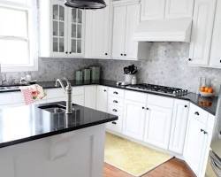
A kitchen with dark countertops and light cabinets can create a strong, balanced look without making the room feel heavy. The light cabinetry keeps the space bright and open, while the darker worktops add contrast, depth, and visual weight.
This combination works across many styles, from traditional and farmhouse kitchens to modern, transitional, and contemporary spaces. The key is choosing the right countertop color, cabinet undertone, backsplash, hardware, and lighting so the contrast feels intentional rather than harsh.
If you are planning a kitchen update, this guide explains how to make the combination work, which materials and colors pair well, and what common mistakes can make the space feel unbalanced.
Why Dark Countertops and Light Cabinets Work So Well
The appeal of this combination comes down to contrast.
Light cabinets reflect more light and can make a kitchen appear larger and more open. Dark countertops create a visual anchor around the lower part of the room, giving the kitchen more definition.
The result is a simple light-and-dark balance:
- Light cabinets create an airy, open feeling.
- Dark countertops add depth and contrast.
- A medium-toned backsplash can connect the two.
- Warm flooring or wood accents can prevent the room from feeling too stark.
- Metal hardware and fixtures provide another layer of detail.
This approach is also flexible. You do not have to choose pure white cabinets and black countertops. Cream, ivory, beige, greige, pale gray, and light wood cabinets can all work with deeper countertop colors.
The Best Cabinet Colors for Dark Countertops
The cabinet color has a major effect on how dramatic or soft the finished kitchen looks.
White Cabinets
White cabinets are one of the easiest choices for a dark countertop because the contrast is clear and timeless.
Bright white cabinetry paired with a charcoal, black, or deep gray countertop creates a crisp appearance. If the contrast feels too strong, introduce warmer elements such as wood flooring, brass hardware, or a warm-toned backsplash.
This combination is particularly useful in kitchens with limited natural light because the lighter cabinetry can help maintain a brighter appearance.
Cream and Off-White Cabinets
Cream cabinets create a softer pairing than stark white.
They work especially well with dark brown, charcoal, black, and stone countertops that contain warm undertones. The result feels less severe and can suit traditional, farmhouse, cottage, and transitional kitchens.
If your countertop has warm veining, cream cabinetry can help pick up those tones.
Light Gray Cabinets
Light gray cabinets offer a more muted contrast.
They can pair beautifully with black, dark gray, charcoal, and deep blue-gray countertops. Because both colors are relatively neutral, you can add interest through the backsplash, flooring, lighting, and hardware.
Be careful with undertones, though. A cool gray cabinet next to a countertop with strong warm brown or beige tones can look mismatched.
Natural Light Wood Cabinets
Light oak, maple, and similar wood finishes can soften dark countertops while adding natural texture.
This is a useful choice if you want contrast without creating a strongly black-and-white kitchen. The grain of the wood also adds visual warmth that painted cabinets cannot provide in the same way.
Dark stone countertops with light natural wood cabinetry can work particularly well in modern, Scandinavian-inspired, rustic, and transitional spaces.
Beige and Greige Cabinets
Greige and beige cabinetry can create a warmer, more relaxed kitchen.
These colors work well with dark countertops that contain brown, taupe, cream, or warm gray elements. They are especially useful when the goal is a sophisticated neutral palette rather than a high-contrast black-and-white scheme.
Dark Countertop Colors to Consider
Not every dark countertop creates the same effect. Its undertone, pattern, finish, and material can dramatically change the appearance.
Black Countertops
Black is the strongest contrast against light cabinets.
A solid black countertop can create a clean, modern appearance, while a black surface with subtle movement can feel more natural and layered.
Pairing black countertops with white cabinets produces a classic contrast, but the rest of the kitchen should provide some visual softness. Wood accessories, warm flooring, natural textures, or warmer lighting can help.
Charcoal Gray
Charcoal is a softer alternative to true black.
It still provides noticeable contrast but tends to feel less severe. Charcoal can be especially attractive with white, light gray, cream, and natural wood cabinets.
If you want the dark-countertop look without making the worktops the dominant feature, charcoal is worth considering.
Dark Brown
Dark brown countertops bring warmth into the kitchen.
They can work particularly well with cream, beige, ivory, and light wood cabinets. The combination can feel comfortable and traditional rather than stark.
Dark brown is also useful when the kitchen already contains warm flooring or wood furniture.
Deep Blue
Deep navy or blue-gray countertops can introduce color while remaining relatively neutral.
They can complement white, cream, and pale gray cabinetry and work particularly well in kitchens where you want something more distinctive than black or gray.
Because blue can have either warm or cool visual qualities depending on its undertone, look at the countertop sample beside the actual cabinet before making a final decision.
Dark Green
Deep green surfaces can create a richer, more nature-inspired appearance.
They pair especially well with light wood, cream, and warm white cabinets. Brass or bronze hardware can reinforce the warmer character of the space.
Choosing the Right Countertop Material
Color is only one part of the decision. The material affects the countertop’s pattern, maintenance requirements, finish, and overall character.
Quartz
Quartz can offer a wide range of dark colors and patterns, including surfaces that resemble natural stone.
A dark quartz countertop with light cabinets can create a polished appearance while giving you plenty of flexibility in terms of color and pattern.
If you are considering quartz, pay attention to the exact sample rather than choosing solely from a small color chip. Veining and pattern scale can look significantly different across a larger surface.
Granite
Granite remains an option for homeowners who want natural stone with distinctive variation.
Dark granite can contain flecks, veins, or mineral patterns that introduce subtle movement against simple light cabinetry. Because natural stone varies from slab to slab, viewing the actual slab can be particularly useful.
Soapstone
Soapstone typically has a darker, softer appearance and can develop character over time.
It can work beautifully with white, cream, and light wood cabinetry, especially in traditional, farmhouse, and relaxed kitchen designs.
Marble and Other Natural Stone
Some dark natural stones offer dramatic veining and movement.
If your countertop has a strong pattern, keep the cabinets and backsplash relatively restrained. Too many competing patterns can make the kitchen feel visually busy.
How to Choose a Backsplash
The backsplash is the bridge between your cabinets and countertops, so it deserves careful consideration.
Use White Tile for Strong Contrast
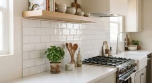
White subway tile or another simple white backsplash can connect dark countertops to light cabinets without introducing another competing color.
This approach is particularly effective when the countertop itself has noticeable patterning.
Choose a Soft Neutral
A beige, cream, taupe, or light gray backsplash can create a softer transition.
This is often a good option when the cabinets are not pure white or when the countertop contains warm undertones.
Repeat a Countertop Color
If your countertop contains several colors, choose one subtle shade from the surface for the backsplash.
For example, a dark countertop with light gray veining can work with a pale gray backsplash. This creates visual continuity without requiring an exact material match.
Consider a Slab Backsplash
Using the countertop material or a visually similar slab as the backsplash can create a more continuous appearance.
This can work especially well with dramatic stone patterns because fewer grout lines allow the material to remain the main feature.
Should the Backsplash Be Light or Dark?
There is no single correct answer.
A light backsplash usually keeps the kitchen feeling bright and makes the contrast between the cabinets and countertops easier to read.
A dark backsplash creates a more dramatic appearance and can visually connect with the countertop. However, using dark surfaces across both areas may make the kitchen feel heavier, particularly if natural light is limited.
Consider the overall balance:
| Kitchen Character | Backsplash Approach |
|---|---|
| Bright and airy | White or light neutral |
| Warm and traditional | Cream, beige, or soft stone |
| Modern and dramatic | Dark gray or coordinated dark stone |
| Natural and relaxed | Warm neutral or earthy tile |
| Patterned countertop | Simple backsplash |
| Simple countertop | More decorative backsplash can work |
Hardware and Fixtures That Complete the Look
Once the cabinets and countertops are selected, hardware can help bring the palette together.
Brass and Warm Metals
Brass, aged brass, and similar warm finishes can add warmth to a kitchen with dark countertops and pale cabinetry.
They are especially effective when the room already contains wood flooring or warm-toned accessories.
Black Hardware
Black handles and knobs can echo a dark countertop and create a coordinated look.
This is an easy way to repeat the darker color elsewhere in the kitchen without adding another major surface.
Stainless Steel
Stainless steel appliances and hardware can reinforce a contemporary appearance.
If the kitchen already has several metal finishes, keep the number of competing finishes under control so the room does not feel visually fragmented.
Use Lighting to Balance the Contrast
Lighting can make or break a dark-countertop kitchen.
A dark surface absorbs more visual attention than a pale one, particularly when the countertop has a matte finish. Good lighting helps keep work areas functional and prevents the kitchen from appearing gloomy.
Consider several layers of lighting:
- Ceiling lighting for general illumination.
- Under-cabinet lighting for countertop work areas.
- Pendant lights above islands or breakfast bars.
- Decorative lighting to add atmosphere.
Under-cabinet lighting is especially useful because it places illumination directly on the countertop where food preparation and other tasks take place.
If possible, consider the amount of natural light before selecting very dark surfaces. A kitchen with large windows can handle a darker palette differently from a small room with limited daylight.
Add Wood to Soften the Contrast
If the kitchen feels too stark, wood is one of the simplest ways to add warmth.
You can introduce wood through:
- Flooring
- An island
- Open shelving
- Bar stools
- Cutting boards
- Furniture
- Decorative accessories
For example, white cabinets, a charcoal countertop, and natural oak accents can create a balanced palette without introducing many additional colors.
The goal is not to fill the kitchen with wood. A few well-placed natural elements may be enough.
Dark Countertops With Light Cabinets in Different Kitchen Styles
The combination can be adapted to almost any design direction.
Modern
Choose simple light cabinets, a dark countertop with minimal pattern, clean hardware, and a restrained backsplash.
Flat-panel cabinetry can make the contrast feel particularly crisp.
Traditional
Pair cream or white cabinetry with a dark natural-stone countertop, detailed hardware, and a classic backsplash.
Warm flooring and decorative lighting can reinforce the traditional character.
Farmhouse
Light cabinets, a dark worktop, natural wood, simple tile, and warm metal hardware can create a relaxed farmhouse appearance.
The contrast works especially well when the rest of the palette remains understated.
Transitional
Transitional kitchens are well suited to this combination because they mix traditional warmth with contemporary simplicity.
Try light gray or cream cabinets, a charcoal or dark stone countertop, simple hardware, and a neutral backsplash.
Scandinavian-Inspired
Light wood cabinets paired with a dark, relatively simple countertop can create a clean contrast without feeling overly dramatic.
Keep the palette restrained and use natural textures to maintain the calm character associated with this style.
Common Mistakes to Avoid
A successful kitchen is not simply a matter of putting a dark surface next to a light one.
Choosing Colors Without Checking Undertones
Two neutrals can look completely different when placed together.
A cool white cabinet may clash visually with a countertop that has strong yellow, tan, or reddish undertones. Always compare physical samples in the actual room when possible.
Using Too Many Dark Surfaces
A dark countertop can be enough contrast on its own.
Adding very dark flooring, a dark backsplash, dark appliances, and dark walls may make the kitchen feel smaller or heavier.
Ignoring Natural Light
A kitchen with little daylight may need more careful planning when using several dark finishes.
Think about where sunlight enters the room and how the space looks at different times of day.
Overloading the Backsplash
If the countertop already has dramatic veining, a highly patterned backsplash can compete with it.
When one surface is visually strong, letting another remain relatively quiet often creates a more balanced result.
Matching Everything Too Closely
Your backsplash does not have to be an exact match for your countertop. Cabinet hardware does not need to match every metal fixture either.
A coordinated palette usually looks more natural than a room where every finish is identical.
How to Test Your Color Combination Before Remodeling
Large kitchen surfaces are expensive and difficult to change, so testing samples is worthwhile.
Place cabinet, countertop, backsplash, and flooring samples together and look at them under both natural and artificial light.
Check them:
- Near a window.
- Away from direct sunlight.
- Under your planned kitchen lighting.
- Beside existing flooring.
- Next to appliances and hardware samples.
Also look at the samples at different times of day. A combination that looks balanced in bright daylight can appear much warmer or cooler in the evening.
If you are choosing natural stone, examine a larger portion of the material whenever possible. A small sample may not show the full scale or direction of the pattern.
A Simple Formula for Balancing the Palette
If you are unsure where to start, think of the kitchen as three visual layers:
Light: cabinets and other large bright surfaces.
Dark: countertops and selected accents.
Middle: backsplash, flooring, wood, or other transitional finishes.
This does not mean every kitchen needs three perfectly distinct colors. Instead, it gives you a useful way to prevent the room from becoming either too stark or too dark.
For example:
- Light cabinets
- Charcoal countertop
- Soft gray backsplash
- Natural wood flooring
- Black hardware
- Warm pendant lighting
Each finish has a job, but they still belong to the same overall palette.
Frequently Asked Questions
Are dark countertops a good choice with white cabinets?
Yes. Dark countertops can create a strong contrast with white cabinets while keeping the upper part of the kitchen visually light. The final effect depends on the countertop undertone, backsplash, lighting, and other finishes.
What backsplash looks best with dark countertops and light cabinets?
A light neutral backsplash is a versatile choice, particularly when the countertop has a strong pattern. White, cream, soft gray, and other restrained neutrals can help connect the two larger surfaces.
Do dark countertops make a kitchen look smaller?
They can make a kitchen feel visually heavier, particularly when combined with several other dark finishes. However, light cabinetry, good lighting, and restrained use of dark surfaces can maintain an open appearance.
What cabinet colors work besides white?
Cream, beige, greige, light gray, and natural light wood can all work with dark countertops. The best pairing depends on the countertop’s undertones and the amount of natural light in the room.
Should hardware match the dark countertop?
It does not have to. Black hardware can echo a dark countertop, while brass can add warmth and stainless steel can reinforce a contemporary look. Choose finishes that work with the complete palette rather than matching one element exactly.
Are dark countertops difficult to maintain?
Maintenance depends on the countertop material and finish rather than color alone. Different materials have different cleaning and care requirements, so follow the manufacturer’s or stone supplier’s recommendations for the specific surface.
Conclusion
Dark countertops with light cabinets give you a reliable way to create contrast while keeping a kitchen feeling bright and balanced. The combination can be dramatic with black surfaces and crisp white cabinets or softer with charcoal, cream, beige, or light wood.
The most important decision is not simply choosing a dark countertop and a light cabinet. Consider their undertones, the backsplash, natural light, flooring, hardware, and the amount of visual pattern in the room.
Start by choosing the countertop and cabinet pairing you genuinely like, then use the backsplash, lighting, hardware, and natural textures to connect the two. With that approach, the contrast becomes a design feature rather than a competing set of finishes.